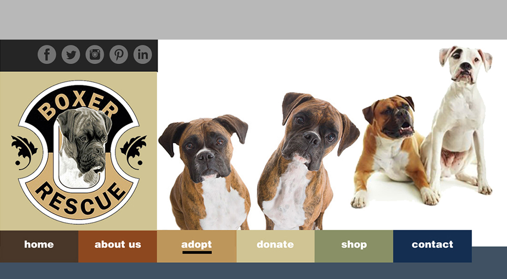
Boxer Rescue Los Angeles (BRLA) is a non-profit dedicated to providing shelter, care,
and finding new homes for abandoned or homeless Boxers.
The primary objective of this research is to analyze the current website used by
Boxer Rescue and identify areas that are a detriment to information findability, site usability, and the
overall user experience. Through user interviews, personas will paint a picture of the site’s end-user.
Heuristic evaluation will classify the severity levels of problems and direct the prototype solution. A
wide-scale survey employing task testing and usability satisfaction will gauge the effectiveness of the
recommendations.
The end results will benefit Boxer Rescue in coordinating goals and future strategic
initiatives to continue to act as the long-term safety net for adoptable and treatable boxer companions
in Los Angeles County.
The goal of this website is to provide Boxer Rescue LA with an online presence for
the community and adoption/foster opportunities for boxer lovers. The site will also provide current and
prospective customer vital information about Boxer Rescue LA business operations and marketing
campaigns. The final product will enhance customer satisfaction and loyalty by improving the usability,
ease of use, and pleasure provided in the interaction between the customer and the end-product. The
redesigned site will ensure organizational structure and presentation of information that makes sense
from a user’s perspective by improving sub-systems and processes.
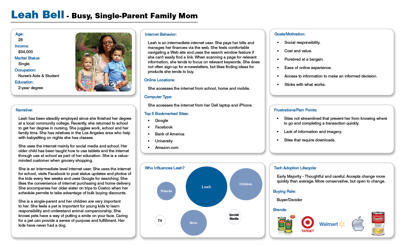
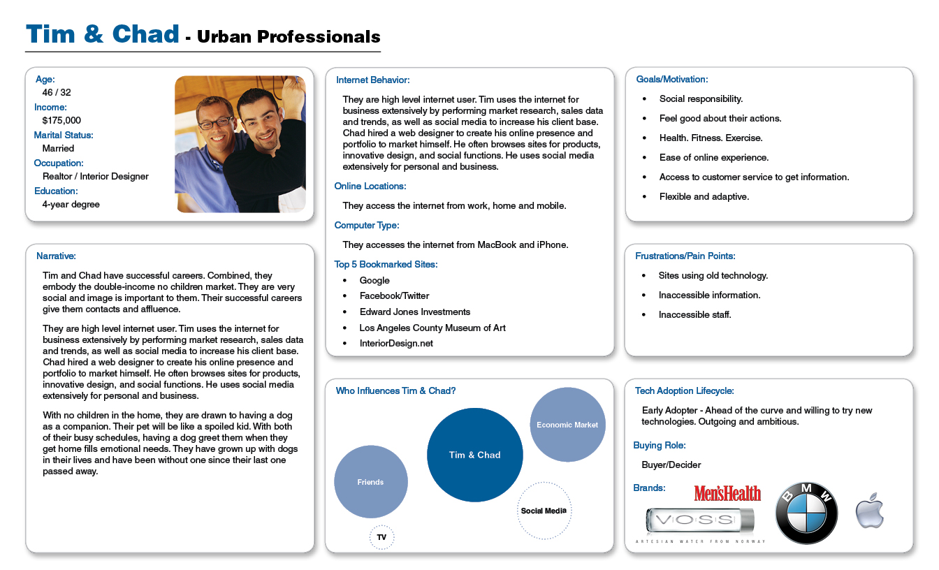
Persona
/ Process
After meeting with the stakeholders, I was able to gauge their target market and
align their business goals with the needs of the identified user. Over the course of a weekend I
performed in-person interviews of four families at the rescue as part of my descriptive research.
The surveys were based on the primary interviewee but consideration was given to family members, if
present. The data from the random sample interviews formed the qualitative and quantitative basis of
the user persona. Two personas were created reflecting typical site users. The first is for a “Busy,
Single-Parent Family Mom” and the second represents, “Urban Professionals."
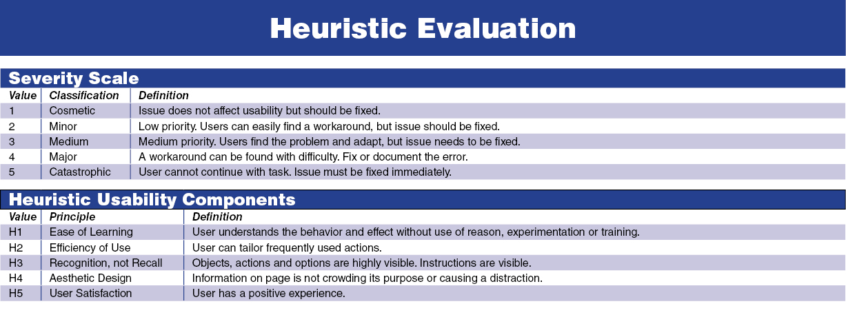
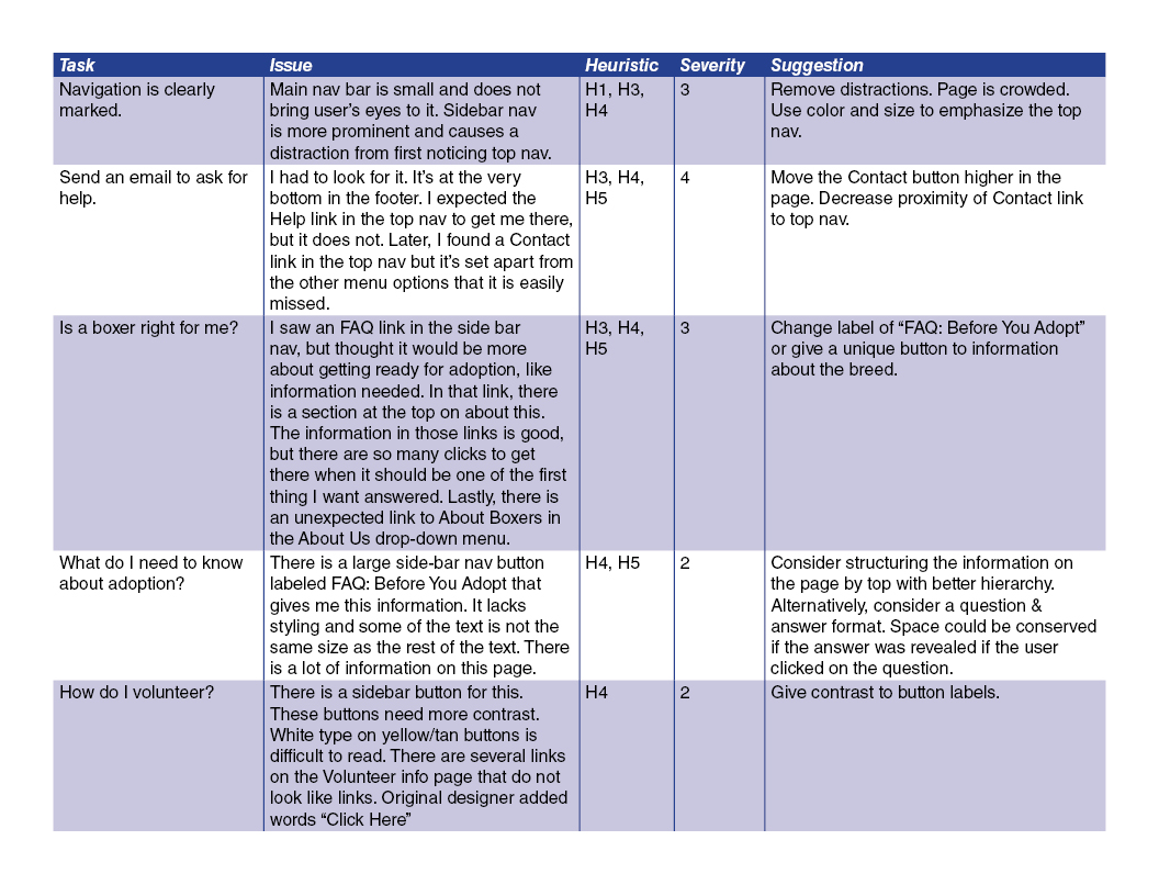
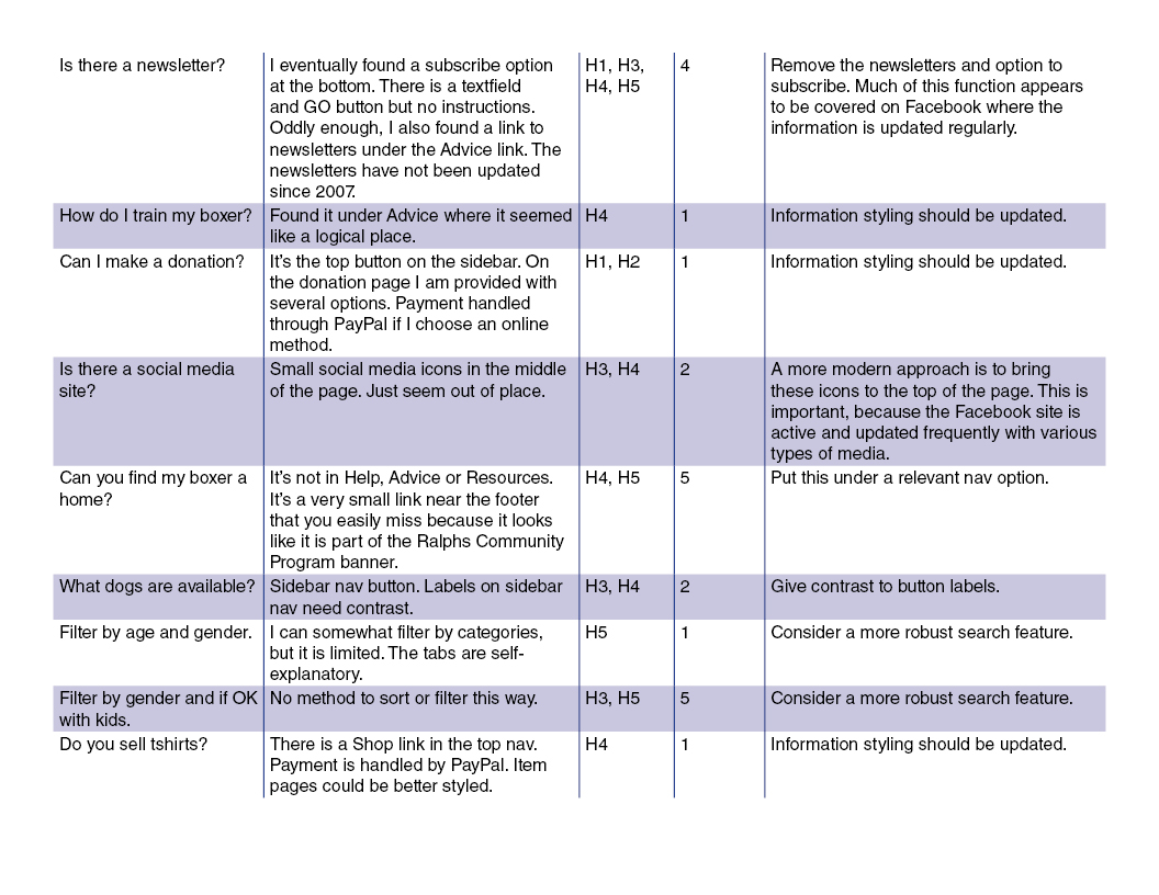
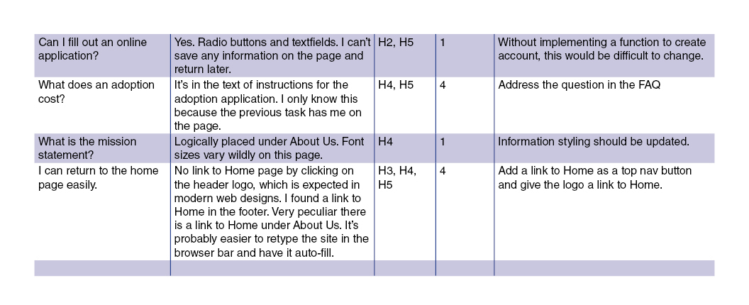
Heuristic Evaluation
/ Process
A heuristic evaluation is a technique to evaluate the usability of an existing design. A heuristic
evaluation on the entire website was performed based on a severity scale that follows standard
research methods introduced in 1995 by the highly respected Dr. Jakob Nielsen. These
severity ratings can be used to allocate resources to fix the most serious problems. Similarly,
the results became an aggregation tool for usability problem prioritization.
I chose to use Nielsen's method because it is an excellent method for finding usability problems in
an interface design so that they can be attended to as part of an iterative design process. Two key
benefits for opting to use this method:
Relatively quick and inexpensive way of obtaining feedback on a design.
Prove a general understanding of the design quality and potential issues.
Identifies issues to be tested in prototype iterations and final user testing.
/ Limitations
The number of initial interviews to gather information to create personas, while performed in-person,
was small due to time and cost factors. This study sought only to provide data for the site's
information hierarchy structure and information taxonomy. These features were developed based on the
current site and heuristic evaluation rather than by card sorting and/or closed card sorting due to time
constraints and required access to a focus group.
Information Architecture
/ Process
The review of the information architecture began in the heuristic evaluation phase
where it was necessary to critically examine both the site’s visual design and how it communicated with
the user, and how the content was structured to allow the user to easily find what they were looking
for. It was found that the top-level navigation labels did not clearly express the subcategories found
within. Similarly, the content in the subcategories were not always strictly focused on said page’s
label. Whereas the site had good intentions to provide an abundance of helpful information and
resources, it lost its focus along the way. This, in turn, resulted in the page not being able to
effectively communicate with the user.
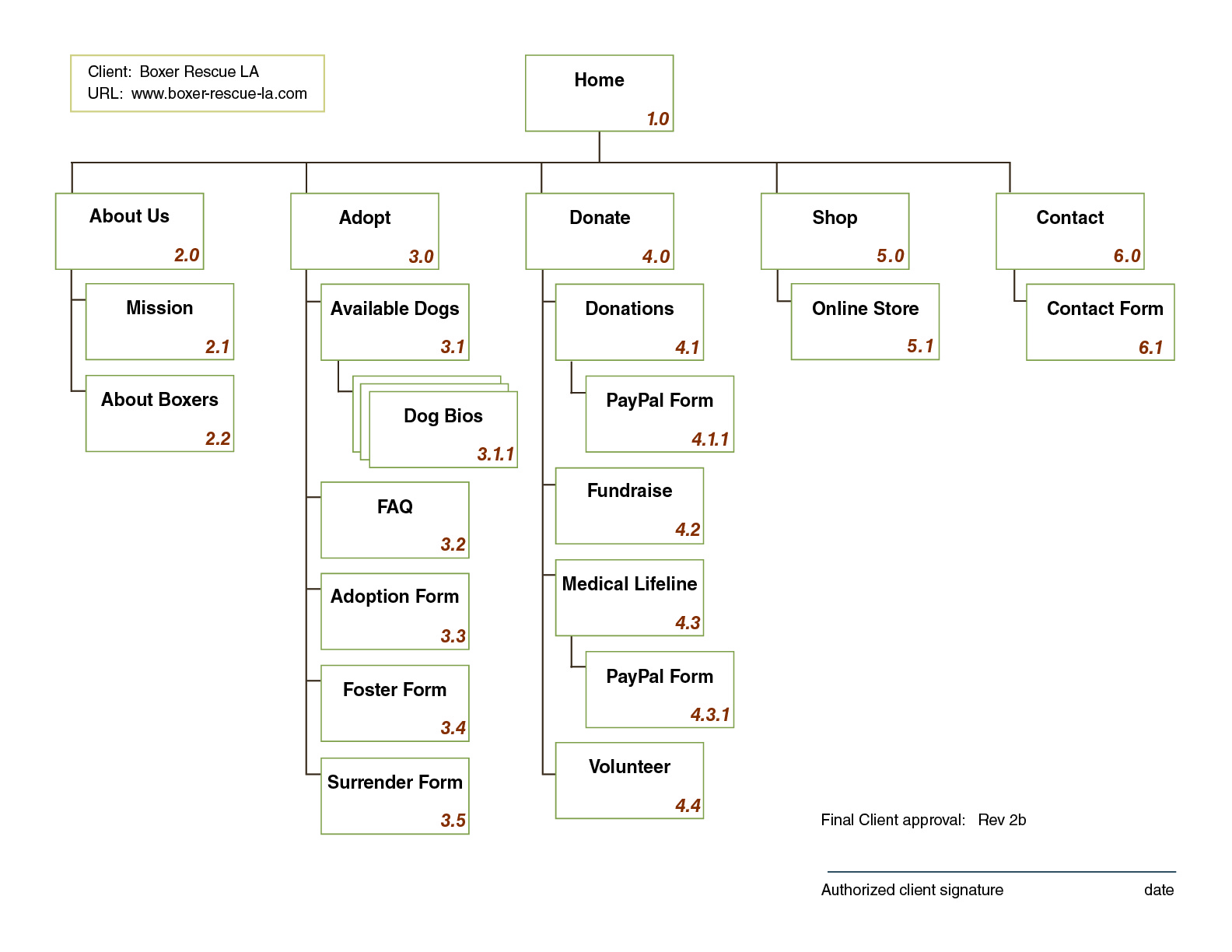
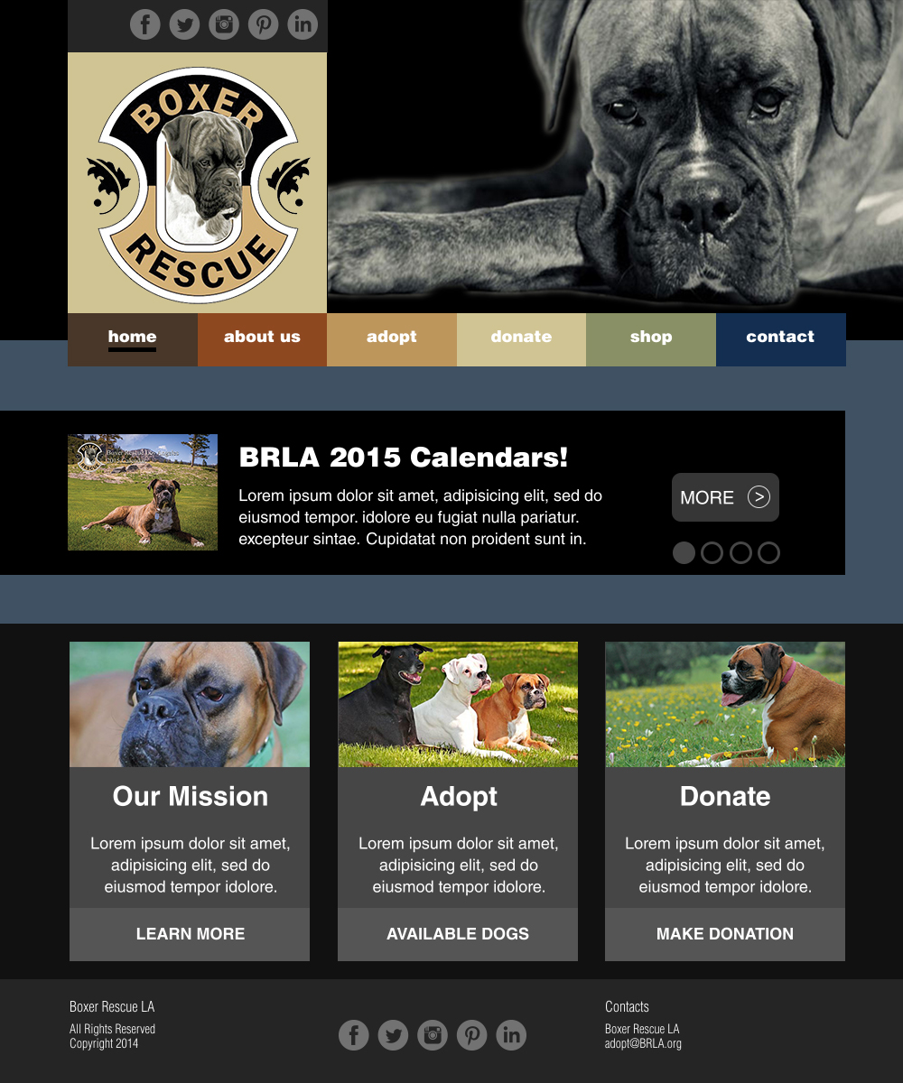
The first step was to narrow down the top-level navigation categories and then succinctly name them. A
‘bottom-up approach” was performed to examine the sub-categories and content to determine how
information should be grouped. In this process, information pages were either combined or eliminated
completely. From understanding the content, I could then take a “top-down approach” to verify that each
top-level category contained relative content pages. These top-level categories allowed me to find the
patterns and relationship between the information. This process resulted in a hierarchical structure. A
co-existing hierarchy pattern was used to develop the sitemap. The main home page leads to subpages,
while also allowing direct access to the child pages. From the child pages, the user can move to the
child page of a different parent by using the top-level navigation.
Design Comp / Paper Prototype
/ Process
It was important that the keywords used in describing the top-level labels were succinct, familiar
terms. All, with the exception of the “About Us” link, are single-word names. I decided to include the
word “us” in the “About” tab to provide a relation to actual caring individuals in an effort to
personalize and humanize the site. It was logical that the mission statement be included here. I also
believed that the page about the breed was appropriate to personify the true purpose of the site and
organization.
Names stating the purpose or describing what could be found on that page were important to allow the user
to know what to find on a page without having to go to that page. For this, the word “Form” is used on
several pages such as “Adoption Form,” “Surrender Form,” and “Contact Form.”
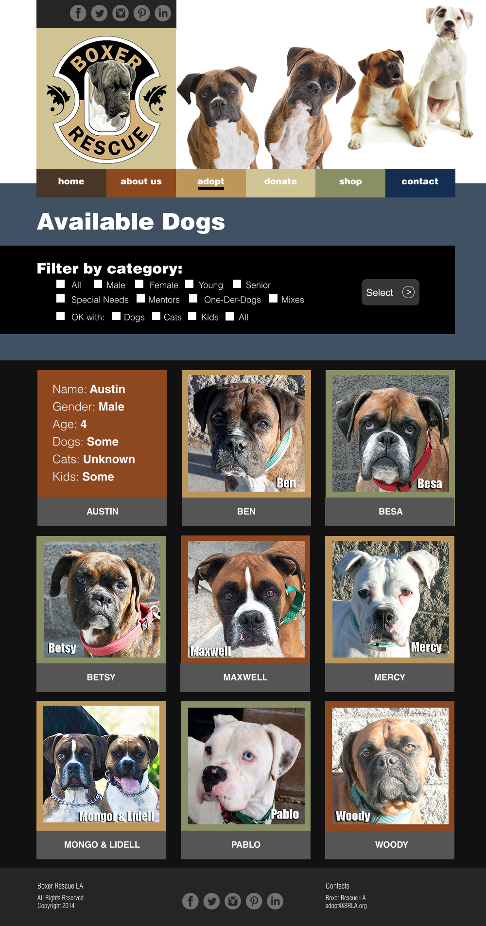
The “Available Dogs” page maintains the feel of the table layout used on the original site, but
organizes this with a modern “metro” style. Each tile flips when the cursor hovers to reveal information
that once had to be accessed by going to another page. Clicking on a tile now brings the user to the
full description bio page for each dog where they will find images and videos as well as the information
about the temperament. This follows the redesign purpose of accessing the desired information with the
least number of clicks.
For testing purposes, a simple list of checkbox filters was used to demonstrate the strength of faceted
searching. Revealing all of the checkbox options also allowed me to test for taxonomy breadth and
appropriateness.
Survey Results
/ Analysis
For the anonymous survey, there were 30 respondents. All of them completed all
three pages of the survey. Question 1 asked for a name or an alias. It had no bearing on the survey
other than to get a commitment level from the respondent. The respondents skewed toward ages 18-34
at a rate of 46.67% with the closest age group of 35-60 at 30% of the group. Gender was equally
balanced. Slightly more than half have a dog and slight less than half have ever adopted a dog from
a shelter or rescue. This group answered that 56% of them have volunteered at a non-profit
organization.
Task analysis is a critical part of any design project and one that is all too
often skipped in favor of other seemingly more interesting actions. Task analysis is a simple and
effective process for laying out tasks from a user’s perspective. This approach helps to avoid the
mistake of automating the frustrations that already exist or repeating past mistakes. It gets you to
the bottom of what the user will want to do and the simplest, most effective way of doing that. One
of the key challenges when conducting task analysis is to let go of what you already think you know
and allow the user’s needs to guide the process instead.
The navigation bar was easily found by all but two of the respondents. I feel that there may have
been some confusion and some respondents may have answered based on the current website for BRLA,
which is known to have issues. Nearly all respondents achieved the desired results for the tasks
overview questions with the exception of Q13 which asked on which tab they might find more
information about the breed. An unexpectedly high number (60%) selected the Adopt tab instead of the
About Us tab.
In the general functionality questions, the average ranking was just slightly higher than 4 out 5.
This signifies an Above Average rating overall. When asked about appearance, the weighted averages
for each category was 2.5 out of 3. The overall satisfaction rating scored a 4 out 5 with two-thirds
agreeing.
/ Conclusions
From the feedback survey, there was strong indication that the new information architecture
demonstrated in the prototype did lead to a far superior user experience. All respondents were able
to locate the navigation bar and ascertain each tab’s contents based on the tab label with the
exception of finding out more information about the boxer breed.
The broad and shallow structure proved to benefit information findability. The social media icons
could be found, but some respondents left comments to move them or give them greater prominence on
the page. When respondents were asked adoption type questions like being able to quickly gain
information about a particular dog pictured or to filter their results, there was an overwhelming
response. The filter to sort attributes for their dog search improved the information findability.
Also, the “mouse hover” over a dog to reveal basic stats increased the site’s usability. In the BRLA
current design, there is no sort feature. Additionally, the current tabs limit findability as does
the requirement to click to another page to receive any stats on a dog.
/ Recommendations
The greatest surprise was that a majority of respondents felt the breed information would be located
under “Adopt” instead of “About Us.” I believe there is a good possibility that by changing the tab
label to “About” may solve this. Card sorting may be required to get a consensus. These findings
should be implemented in a live mockup for the client to consider with various color palettes. There
was considerable feedback that the color black invoked sadness.